Coloplast
Design system

System Designer
Copenhagen 2022-2023
1 year 5 months
Coloplast, established in Denmark in 1957, stands as a global leader in medical devices and services, specializing in ostomy care, continence care, wound care, and skin health.
Renowned for its innovative solutions, the company is committed to improving the lives of individuals with intimate healthcare needs. From ostomy bags and catheters to wound dressings and skincare products, Coloplast offers a comprehensive range of tailored solutions aimed at enhancing comfort, dignity, and independence.
Coloplast was struggling to keep brand- and design consistency across its 100+ international websites for end-consumers and healthcare professionals. Years of relying entirely on agencies for UX/UI work, had resulted in a highly incoherent and outdated presence across all digital channels.
Not only was this turning into a major maintenance and financial issue, hindering any further brand development. It was also starting to affect how end users and even Coloplast itself perceived the brand.
Smaller release deadlines were met throughout the project, and a v1.0 of the Figma design system and the frontend Node packages, were launched during the Summer of 2023.

Before I joined Coloplast in 2022, there had already been a first stab at a POC of a design system, but sadly the project was unsuccessful and put on hold.
I got on board after a round of “restructuring”, leaving non of the original team members to join the new project. The new project group consisted of mid-level management, product owners, a project manager, a design manager, a release train engineer, a frontend architect and myself.
While going over the original POC, it seemed like a lot of good thoughts had gone into it, and they managed to build a simple UI library in Figma, with a handful of key components. So what caused the project to fail? The idea of a design system was initially suggested to management, after a research phase, and accepted early on. But months after, when presenting a conceptual button frontend component in Figma as the result of their labor, management lost their patience and the project was put on ice. Leading members of the new project team, had some valuable insights to what went wrong:

Everyone on the team was convinced a design system was the right solution, but we needed a new plan to get management fully behind the project. And fast.
We did two full-day workshops to set the direction for the project. One outcome was to focus on a full inventory of the existing websites and apps to:
Some of the high-level issues we identified during this initial phase:
Examples of low-level issues identified:
We also carried out a thorough analysis of 10+ top design systems (e.g. Atlassian, IBM, Shopify, Pinterest, Google and more) for inspiration on scope and direction we wanted take.

Acknowledging that implementing an entire design system in an large organization was going to be a huge undertaking, combined with palpable pressure from management to not repeat past mistakes, we set out to address several low-hanging issues asap. We needed to prove that our team was capable of delivering small tangible improvements, while clearly communicating the plan and building the larger system.
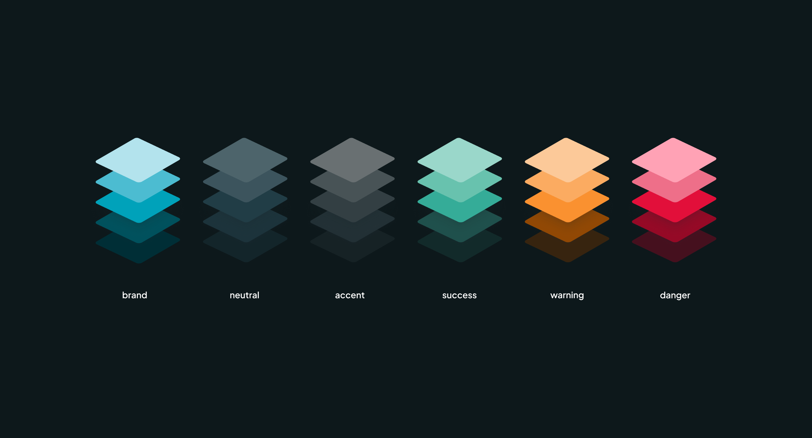
To address one of our core tasks - accessibility - early on, the design system team decided to focus on building and rolling out a color system. Not only would it add value to the digital products and design teams by providing a unambiguous way of working with colors. It would also address the upcoming legal requirement for WCAG 2.1 support, which management had stakes in. Also, it would force us to get all the base systems up and running in order to push things into production.
With a limited crew of only 2, the front-end architect and myself, started to plan and set up all the foundational systems required to release a color system. This included setup of the necessary servers, repos and file structure, defining naming conventions, setting up base files and layouts in Figma, testing design tokens and a lot more.

Coloplast had a limited set of brand colors, and we needed more granular control to cover the many color combinations for buttons, states, theming, etc.
Our team had grown with an additional designer and together we defined 10 core palettes, to form the foundation for the semantic and component level colors. This involved A LOT of testing, reviewing color models, researching best practices, refactoring, checking color contrasts, and more testing. (Thank you for staying in the fight Mia 🙏🏻).


The semantic color layer and color roles (foreground, background, border, focus etc.) were added to bring purpose to color names, and simplify the number of colors available to designers. We tested a handful of different naming approaches on designers and developers to determine the best one.
The intention was that this abstraction would make it a easier to choose colors, while putting up guardrails to make it harder for designers to go rogue.
For example, muted secondary text, would use the color color.fg.muted. Also we hoped it would help designers and
developers establish a shared language around colors in general.


With Coloplast's large group of customers experiencing disabilities of all sorts in mind, we set up the typography system with focus on legibility, while balancing Coloplast's spacious and friendly feel.
To streamline how headings and body text behave on different device sizes, the underlying token system was designed to support responsiveness.

Lorem ipsum dolor sit amet, consectetur adipisicing elit. Ullam ipsam corporis ad! Quam officiis fuga nam blanditiis iusto vel? Molestiae non id voluptatum! Debitis id enim fugit sit voluptas quaerat.


All systems and components were thoroughly documented, with usage examples, best practices, accessibility details, content guidelines, behavior- and motion principles, and design tokens.


To move away from the manual process of transferring design decisions from Figma to the frontend, we implemented an automated workflow using Tokens Studio. Design tokens are now stored in a shared repository, allowing the frontend team to pull and convert them into CSS variables seamlessly. Everything from colors, spacing, sizing, typography and breakpoints.
This ensured a much tighter integration between decisions made on the design side of things and what was presented in the final products.
